
Most small business websites fail for the same reason: they look like someone’s first website project, built in an afternoon without a clear idea of what the site is supposed to do. Good website design ideas for small business start with one question — what does a visitor need to see, and what do you need them to do next? Everything else (colors, layout, page structure) should answer that question. This guide collects the ideas I use across WordPress builds to help small businesses get more from their sites.
Table of Contents
What Makes a Small Business Website Work
Small business websites succeed when they do three things clearly: explain what you offer, show why you’re trustworthy, and make it easy to take the next step. Before any design decisions, settle on your conversion goal — phone calls, contact form submissions, or bookings. Every design choice should move visitors toward that goal.
Before you get into design ideas, check your website design cost guide to understand what realistic budgets look like for the features you’re planning. Design decisions and budget decisions are connected — knowing what things actually cost helps you prioritise the ideas worth investing in.
Homepage Design Ideas That Work
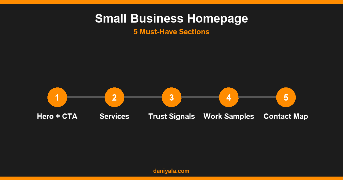
The homepage is your site’s first impression. According to Google’s Core Web Vitals research, pages that load in under 2.5 seconds have significantly better engagement rates. Every homepage design decision should keep speed in mind, not just aesthetics.
Ideas that consistently convert for small businesses:
- Hero section with a clear value proposition. A headline that states exactly who you help and how, a one-sentence description, and one prominent CTA button. Not “Welcome to our website” — something like “WordPress websites that load fast and rank on Google.” The more specific, the better.
- Social proof above the fold. A row of client logos, a “45 five-star clients” bar, or a short pull-quote. Whatever social proof you have belongs near the top, not buried in a testimonials section on page three.
- Services listed with outcomes, not just names. Instead of listing “SEO Services,” write “Help your site rank higher and get found by customers searching Google.” Outcome language converts better than service names.
- One primary CTA and one secondary CTA. A “Book a Call” button (primary) and a “See Our Work” link (secondary) is cleaner than five different options. Too many CTAs create analysis paralysis for the visitor.
- Recent work or portfolio thumbnail. Three to six project thumbnails, each linking to a case study or full portfolio page. Seeing real work is the fastest trust builder, especially for design and development services.
Page Structure Ideas
Most small business sites need fewer pages than their owners think. Start lean, then add pages when traffic data shows demand. Here are the pages every service business needs:
- Homepage — conversion-focused overview with your primary CTA
- Services page — one dedicated page per service if you have three or more, or a single organised page for fewer
- About page — the story of you or your business, not a corporate bio. First-person, specific, shows personality.
- Portfolio or Case Studies — for any service-based business, real client work is your most powerful sales tool
- Contact page — a form, a phone number, an address if relevant, and a map if you serve a specific area
- Blog or Resources (optional) — valuable for SEO if you can produce content consistently; skip it if you won’t maintain it
See how other small businesses structure their sites in my guide on website design for small business — it covers page structure and layout patterns in more depth, including which page types drive the most leads for service-based businesses.
Mobile Design Ideas
Over half of all web traffic in most industries comes from mobile devices, and Google uses mobile-first indexing — meaning the mobile version of your site is what Google evaluates for rankings. Mobile design is not optional.
- Tap-friendly buttons. Minimum 48px height on all clickable elements. Buttons that are too small on mobile frustrate users and increase bounce rates meaningfully.
- Single-column layout below 768px. Multi-column layouts that look elegant on desktop become unreadable on mobile if they’re not properly responsive. Use a tested page builder rather than custom CSS that breaks on older phones.
- Phone number as a clickable link.
tel:links let mobile users call you with one tap. Add it to your header and contact section. - Simplified navigation menu. A hamburger menu with 4–5 main links is cleaner than exposing your full navigation on mobile. More than 6 links in a mobile menu and users start skipping navigation entirely.
- Fast-loading images. Compress every image before uploading. WebP format with appropriate sizes for mobile viewports can cut page weight by 40–60% compared to unoptimised JPEGs.
Color and Branding Ideas
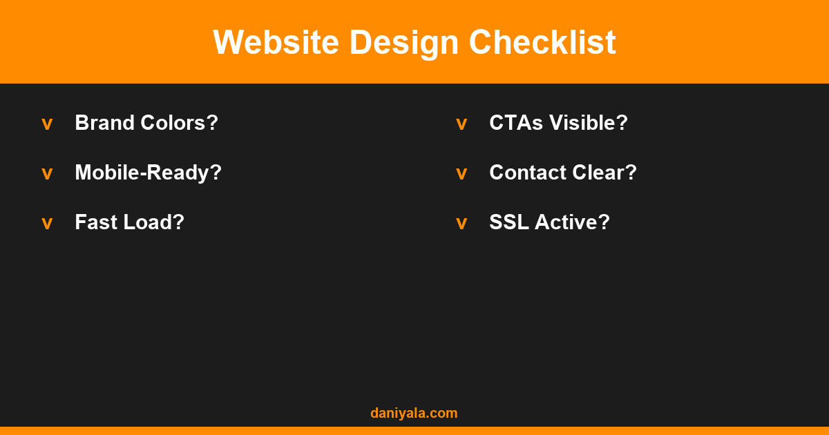
Color choices communicate trust, personality, and professionalism before a single word is read. For small businesses, simplicity wins over complexity.
- Two-color brand palette. One primary (your brand color) and one accent (usually a contrasting highlight for CTAs and headings). Add white and a dark near-black for text and backgrounds. Four colors maximum — more than that gets chaotic fast.
- High contrast for text. Dark text on light backgrounds or light text on dark backgrounds. Low-contrast text is an accessibility issue per WCAG guidelines and makes reading exhausting on bright screens.
- Consistent use of your primary color for CTAs. Every “Contact Us” or “Book a Call” button should be your primary brand color. Consistency trains visitors to recognise what to click.
- Real photography over stock photos. Even amateur photos of real people on your team, real work you’ve done, or your actual workspace convert better than smiling strangers from stock libraries. Real images build genuine trust.
- Consistent typography. Two fonts maximum — one for headings, one for body text. Google Fonts has free options that load quickly. Poppins, Inter, and Nunito pair well for professional service businesses.
Call-to-Action Ideas That Convert
A call to action tells your visitor what to do next. Vague CTAs (“Learn More,” “Click Here”) underperform specific ones (“Get a Free Quote,” “See Available Dates”). Here are the ideas that work for small businesses:
- Primary CTA in the header. A contact or booking button in the top navigation bar, visible on every page without scrolling. This alone can improve contact rates significantly.
- Midpage CTA after social proof. After your client testimonials or portfolio section, add a CTA: “Ready to work together?” with a clear button. Visitors who have just read social proof are in the most receptive mindset to convert.
- Sticky header CTA. A header that stays visible as users scroll keeps your contact button always accessible without requiring them to scroll back up.
- Offer-based CTA. “Get a free 30-minute consultation” or “Get a quote in 24 hours” outperforms generic “Contact Us” because it tells the visitor exactly what they get when they click.
For a deeper look at which design patterns perform best, my guide on the best website design for small business includes specific layout comparisons. And if you’re planning to optimise your site for Google at the same time, pair your design decisions with an SEO strategy for small business — design and SEO planned together tend to outperform retrofits.
Performance and Speed Ideas
Design ideas don’t matter if your site loads in 8 seconds. Speed is both a ranking factor and a direct driver of conversion. These are the ideas I apply to every WordPress build:
- Use a lightweight theme. GeneratePress, Astra, and Kadence are all fast bases that work well with page builders. Avoid themes bundled with 20 plugins and slider demos — they carry speed overhead from day one.
- Optimise images before and after upload. Use Squoosh or Imagify before uploading. Use a plugin like ShortPixel to auto-compress future uploads. Serve images in WebP format.
- Enable a caching plugin. WP Rocket or LiteSpeed Cache can halve your load time with minimal configuration. Caching is one of the highest-leverage speed improvements available without touching your theme or code.
- Use a CDN. Cloudflare’s free tier serves static assets from servers close to your visitors. For a small business site, this can improve load times for visitors in different cities or countries significantly.
- Minimise plugins. Every plugin adds HTTP requests and potential render-blocking scripts. Audit your plugin list quarterly and remove anything not earning its place.
Frequently Asked Questions
How much should a small business website cost?
A professionally designed small business website built on WordPress typically costs $500–$3,000 depending on the number of pages, custom functionality, and the developer’s location. Ongoing costs (hosting, maintenance, domain) run $150–$500 per year. My website design cost guide breaks this down by project scope and complexity.
What pages does a small business website need?
At minimum: Homepage, Services, About, and Contact. Add a Portfolio page if you have visual work to show, and a Blog page only if you can commit to publishing content consistently. Most small business sites perform well with 5–8 pages total — more pages aren’t always better if they’re thin or unfocused.
Should I use WordPress or a website builder like Wix?
WordPress is the better long-term choice for most small businesses because it gives you full ownership of your content, better SEO control, and the ability to add virtually any functionality via plugins. Wix and Squarespace are easier to start with but harder to scale and migrate away from if your business outgrows them.
How important is mobile design for a small business website?
Critical. Google uses mobile-first indexing, so how your site looks and performs on mobile directly affects your rankings. Additionally, the majority of local searches happen on mobile devices. A site that works poorly on mobile loses those visitors to competitors with better mobile experiences.
What colors work best for a small business website?
The best color scheme matches your industry expectations while differentiating you. Trust-based services (legal, financial, medical) tend toward blue and navy. Creative services (design, marketing) use bolder palettes. The practical rules: maintain high contrast for readability, use your primary color consistently for CTAs, and limit yourself to 2–3 brand colors so the site doesn’t look chaotic.
Need help implementing this? I’m Daniyal — freelance SEO & WordPress expert. Contact me or find me on Upwork.



 by Daniyal © 2026 All Rights Reserved